Why Get Your Colors Done When You Could, I Dunno, Just Wear Black
Mum says I look great in all hues but I'll be damned if you catch me in purple.
Last year, color season analyses were blowing up all over social feeds. You know, people on TikTok sticking their faces in various filters and declaring, “Wow, I thought I was a True Summer, but actually I’m a Soft Autumn,” and whatnot? ICYMI…
This analysis dates back to the 17th century when the color wheel was invented. The theory that different shades complement people based on their skin tones grew in popularity in Hollywood in the 30s, before businesses in the 80s like Colour Me Beautiful and House of Colour began offering the analysis as a service, which now influences TikTokers.
Today, this practice has understandably drawn criticism as it was created with only white women in mind highlighting just how truly outdated it is to “get your colors done.” People of color were automatically categorized as Deep Winters, which Colour Me Beautiful has since stated is not accurate. It's now very common to see influencers filming fabric swatches draped over them on their quest for personal style to understand the colors, textures, and patterns that are the most (trigger warning: dreaded f-word) flattering, despite the theory's racist roots and apparent flaws.
My Two Cents
Now, I’m not sure if it's intuition or pure delusion, but I’ve always been confident in the choices of what I put on my body. Not to say I don’t have any regrets about stuff I’ve worn looking back (oh, to be young, Australian and shopping at Supré), but at the time, you couldn't tell me I wasn’t the shit. Putting rules and labels in place about what colors to wear and avoid based on your features and skin tone just feels restrictive. Different hues have different impacts on different people.
I like black. I’m from Melbourne and I relish in the stereotype that we are pretentious coffee wankers who only wear dark colors because we never got over the early 90s recession and the weather is rubbish. Despite my mum constantly telling me to wear bold colors growing up because they “suit me,” black just makes me feel chic, sexy and a little bit like Nick Cave now that my hair has grown out weird.
Others may not feel the same way and think black is depressing (jokes on you, I’m already depressed). Some archaic rules repackaged through TikTok may try and tell me that based on the color of my irises or the undertone of my skin, black makes me look washed out or sickly. It doesn’t, but even if it did, I don’t get dressed in the morning to “highlight my natural appearance” because, at the end of the day, fashion doesn’t need to be harmonious and I don’t have to look “appealing” to anyone.

Online Color Analysis Tools
You may think that the rest of this post is just me trying out seasonal color analysis tools and mocking them but I promise I went into this with an open mind. Doing a quick Google search, I understand why kids get sucked into this - there are bajillions of different options to play with.
The first one I tried was real amateur-hour stuff. You do a quiz on some dated website with a tonne of pop-ups about your eye, hair and skin color and it tells you if you’re a Summer, Autumn, Winter or Spring palette. Despite ticking dark hair and eyes, it still decided I was a golden-haired Spring girlie and then rattled off a laughable list of my best colors, which included coral, light pink, and light orange. Sorry, did my mum program this?

Next, we got to some more techy stuff on Colorwise.Me, which involved uploading selfies and using the eye dropper tool to match your bits. This time, I’m a Deep Winter, with a palette containing dark and vivid colors. It told me that black would be a staple of my wardrobe (accurate) along with grey (love) and navy (love/hate relationship) and also wildly selected out some purples I wouldn’t touch if I were naked in public with no other option. By the looks of the “avoid” palette, I should steer clear of snotty greens and mustard yellows. No problems there Colorwise.Me!

Vivaldi Color Lab is probably the best website if you’re into this sort of thing. Here, you upload a selfie and choose which surrounding colors best suit you, advising you to choose shades that brighten your skin and reduce the dark shadows under your eyes (C’est impossible - I’m European and don’t sleep well so under-eye circles are something no color or cold cream will ever fix). Then you’re assigned one of their twelve seasons, and this time, ya girl is a Deep Autumn.

Color Analysis With ChatGPT
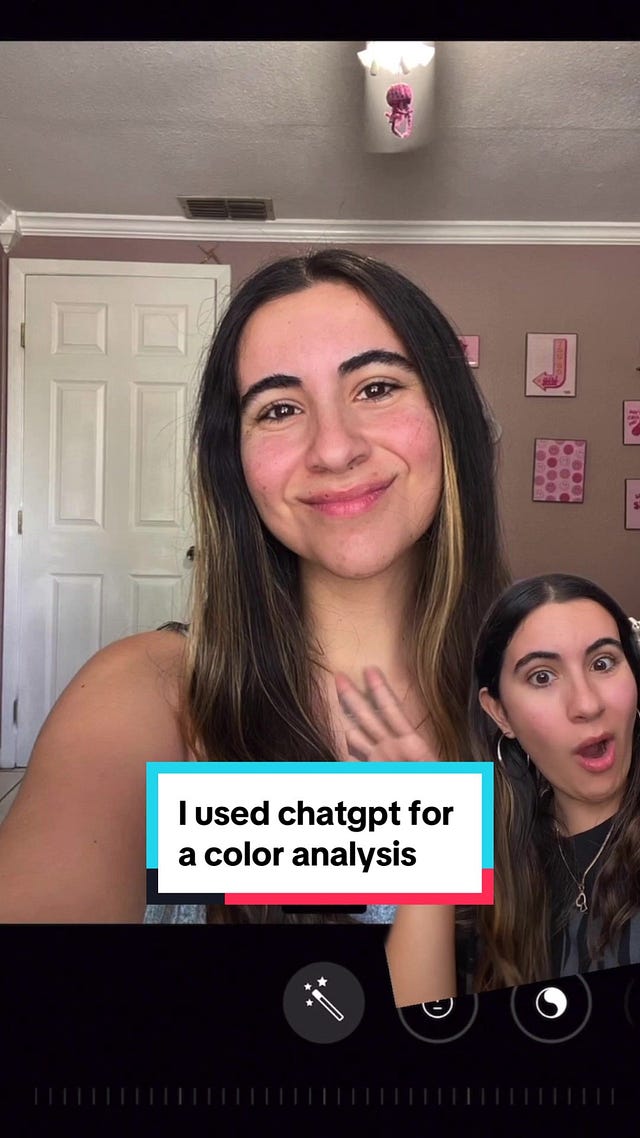
According to TikTok, you can also perform this analysis with our good friend ChatGPT. Here are the instructions on how to do so (I just wanted to point out that according to this clip, these IRL services people actually go to cost a couple of hundred dollars. In this economy!?)
Okay, so using a not-too-ugly selfie, I used the color picker for my skin (#aa7e6b), hair (#2c2627) and eyes (#563d31). ChatGPT backed up Vivaldi to say I was an Autumn. Here’s the information it gave me:
Based on your skin tone, hair color, and eye color, you likely fall into the "Autumn" color palette. Autumns typically have warm, earthy tones in their skin, hair, and eyes, which align with the colors you provided. This palette is characterized by rich, warm colors like deep browns, olive greens, warm reds, and golden yellows.
For someone with an Autumn color palette, here are some colors that typically suit you well:
Earthy tones: Rich browns, warm oranges, deep greens, and olive.
Warm neutrals: Camel, beige, taupe, and warm grays.
Warm jewel tones: Deep reds, burnt oranges, mustard yellow, and warm burgundy.
Rich blues and teals: Navy blue, teal, and turquoise.
Warm metallics: Gold, bronze, and copper.
Colors to generally avoid as they may not complement your natural tones as well include:
Cool tones: Such as icy blues, cool pinks, and grayish shades.
Harsh, stark colors: Bright, neon shades that are too intense.
Pastels: Soft pastel shades may wash you out.
Very light or very dark colors: Extreme contrasts may not harmonize with your natural warmth.
Cool metallics: Silver and platinum can sometimes clash with the warmth of your skin tone.
For someone with an Autumn color palette, here are some lipstick shades that typically complement your natural tones:
Warm reds: Look for brick reds, terracotta reds, or rusty reds. These shades complement the warmth of your skin tone.
Rich berries: Deep berry shades with warm undertones, like cranberry or wine, can enhance your natural warmth.
Terracotta and burnt orange: These shades harmonize with your warm undertones and can add a beautiful pop of color.
Warm browns: Opt for shades like caramel, chestnut, or chocolate brown for a natural, earthy look.
Coral and peach: Soft coral or peachy shades can brighten your complexion and add a fresh, youthful touch.
It's best to avoid very cool or icy tones like blue-based reds or pale pinks, as they may clash with your warm undertones. Instead, focus on shades that have warm undertones and complement the natural richness of your Autumn palette.
Okay so while it did me dirty by saying to avoid black and white and opt for peach lipstick, I will say I was impressed that a robot provided the most human advice that these other sites failed to mention.
“Keep in mind that personal style and preferences play a significant role in what colors you feel comfortable and confident wearing. These are just general guidelines, and experimenting with different colors can help you find what works best for you.”
- ChatGPT, bot, stylist, motivational speaker
After all this hard work on my end, ChatGPT got a glow-up and has been updated so you can just do this with a photo. Using the exact same photo as I did to pick my colors, I was given totally different advice this time. Here is it with my personal commentary in brackets.
Based on your photo:
- Skin Undertone: Your skin appears to have neutral to slightly warm undertones.
- Hair Color: Your hair is a deep, rich black.
- Complexion: Your skin appears to be fair to medium.
Considering these factors, you might fall into the Winter palette due to your cool undertones and darker hair color.
Colors to Wear:
- Jewel tones: emerald green, royal blue, sapphire, and deep purples. (Nope)
- Icy tones: icy blue, icy pink, and icy lavender. (Ew Nope)
- Pure white and black. (Hallelujah)
- Charcoal gray and navy blue. (Alright, alright, alright)
- True red and bright pink. (Red yay, pink nay)
Colors to Avoid:
- Orange, tomato red, and warm browns. (Lies, I look amazing in any red or brown)
- Mustard yellow and golden shades. (Accurate)
- Beige, camel, and soft pastel colors. (Always neutrals, never pastels)
Okay, so that's half accurate. Now, it’s put together some outfits for me, which I can get on board with except for the blue dress and purple sweater.
- A crisp white blouse, a sapphire blue dress, or a deep purple sweater.
- Black pants, charcoal skirts, or navy trousers.
- Silver jewelry, black handbags, and deep red scarves.
And with avoid, that dreaded f-word appears again. I love gold and silver jewelry and don’t believe they should be exclusive.
- Earthy tones like camel, mustard, or rust-colored tops.
- Steer clear of brown pants or beige skirts.
- Warm-toned jewelry such as gold might not be as flattering.
It even picked out some lipstick for day and night, which is cute but you’ll never catch me with a pink lip.
- Daytime Look: A bright pink or fuchsia lipstick for a pop of color.
- Evening Look: A deep cherry red or berry lipstick to make a bold statement.
Why I Hate This
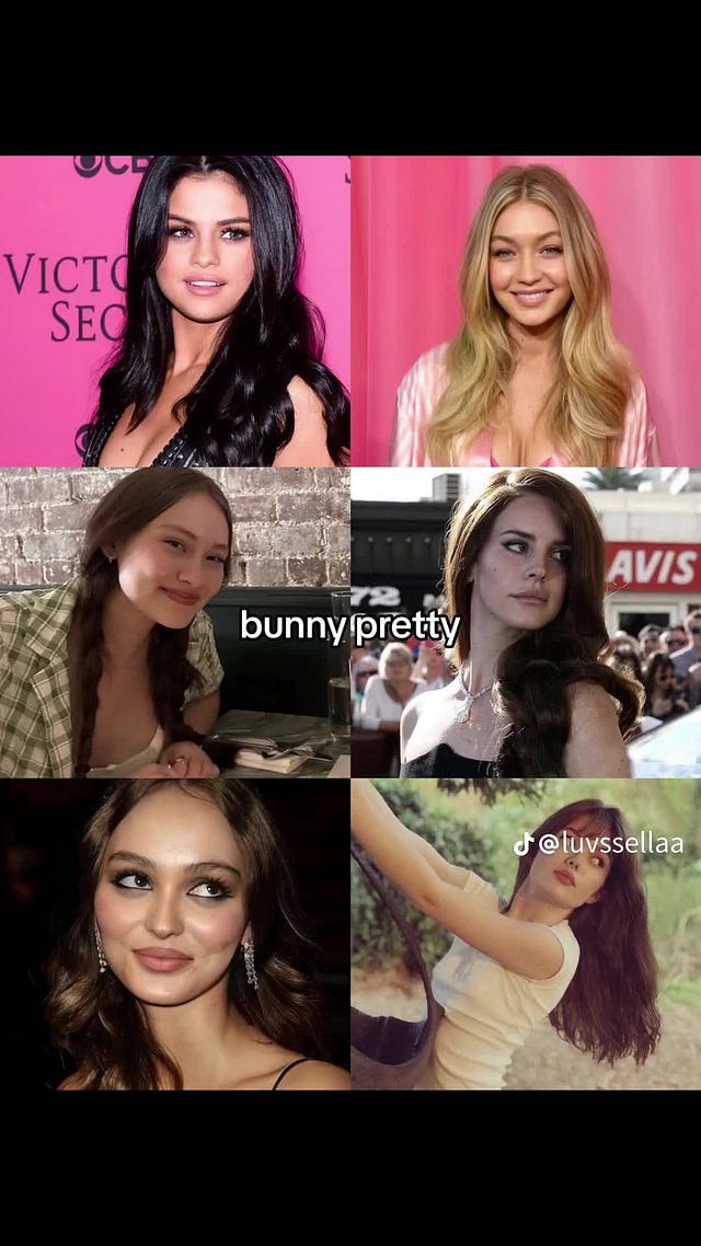
Apart from the inconsistencies, remember when TikTok said that girls are four types of pretty: fox, cat, bunny, or deer? Yeah, it feels kind of like that bullshit, an ongoing obsession to label ourselves for the algorithm and then base an entire look and personality on it.
This could all be really helpful, accessible information for someone who is trying to work out what they like and develop their personal style. However, I believe you need to also take into account what you like and feel good in. Maybe that is what looks best on you but that’s not up to an obsolete theory or AI to decide.
What worries me about the revival of color season analysis is it coincides with body type analysis, for which I seem to keep getting targeted content. You know, the ones echoing the sucky 90s content (probably earlier but drawing from experience) where magazines would tell you that if you have a body type based on a certain fruit, vegetable or intimate object, you could only wear a certain cut of jeans. And if you fell on the bigger end of that spectrum, best believe Vogue or Dolly recommended the ugliest style possible because it was necessary for you to be othered.
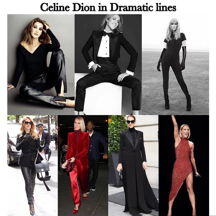
I’ve seen countless accounts referencing the Kibbe body types (developed, of course, by a white man for white women) knocking about socials. People spending their days uncovering which celebrities are a Soft Dramatic or a Flamboyant Gamine and influencers dressing within these rules. Of course, in the name of research and dedication to my craft, I did the Kibbe Body Type Analysis, which my therapist will hate me for. I won’t put a link in here because I think it's rubbish. I don’t want you, dear reader, to do it, and I certainly don’t want to boost their SEO ranking.


In a nutshell, it’s divided into three sections, which you need to measure, scrutinize, and rank: Face, Flesh, and Bone. For some reason, it believes your nose shape or the distance between your eyes and cheekbones impacts how you should dress, which is wild. While I won’t reveal which gross category it put me in, I’ll share the bullshit advice it gave me on how I should dress including avoiding oversized clothing, opting for soft florals and V-necklines (aka the Devil’s Neckline) as if I ever would. Here ya go.
What To Wear:
Fitted Silhouettes: Emphasize your curves with tailored clothing that follows your natural body shape.
Soft Fabrics: Opt for fabrics that drape and flow gracefully over your curves, such as silk, satin, chiffon, and soft knits.
Waist Emphasis: Highlight your waist with belted styles or garments that cinch in at the waist to accentuate your hourglass figure.
Soft Necklines: V-necklines, sweetheart necklines, and scoop necks are flattering and complement your natural curves.
Details and Embellishments: Delicate ruffles, lace, bows, and other feminine details add interest and enhance your aesthetic.
Soft Prints: Floral prints, soft geometric patterns, and delicate prints can enhance your feminine look without overwhelming your frame.
What to Avoid:
Boxy Silhouettes: Avoid shapeless or overly boxy clothing that hides your curves and may make you appear larger than you are.
Harsh Lines: Steer clear of sharp, angular lines and instead opt for softer, rounded shapes that complement your natural curves.
Oversized Clothing: Avoid oversized or excessively loose clothing that can overwhelm your petite frame.
Heavy Fabrics: Thick, bulky fabrics can add unnecessary bulk to your silhouette. Opt for lighter, softer fabrics that drape well.
Overly Structured Styles: Extremely structured garments with strong tailoring may not complement your aesthetic as well.
High Necklines: Avoid high-necked tops and dresses that can visually shorten your neck and make your upper body appear more compact.
Again, this may be an accommodating guide for some. But for me, it's just a great exercise to find new ways to hate yourself, and it makes me so frustrated to see young women online solely basing their expression on rules created by some old white dude.
Anyway, in conclusion: Wear what colors, shapes and styles you want. I certainly will. Silly Little Outfits will remain full of black and boxy silhouettes and whatever else I love that I should “avoid” because no one tells me how to dress.


